


Buttons are one of the most common elements in all of UI. It'll probably be the first thing you see when you open up a new component library or start working on a new project.
They can be surprisingly complex when you factor in all the different states and implications a button can have when pressed, clicked, or tapped.
Think about these differnt states you need to consider when designing a button:
- Full color, outlined, or "ghost" buttons
- Loading, disabled, and submitting states
- Button sizes like sm, md, and lg
- Hover, focus, and active states
- Buttons used as links, vs buttons used as... well, buttons
After all is said and done, you can still do more to make sure your button looks "clickable". Here are a couple ways you can enhance a button.
Techniques for making buttons look more "clickable"
Overlap content sections
Add animations
Add
cursor: pointer
1. Overlap content sections
An element that sits on top of 2 sections looks like it almost "floats", and looks like it could be clicked.
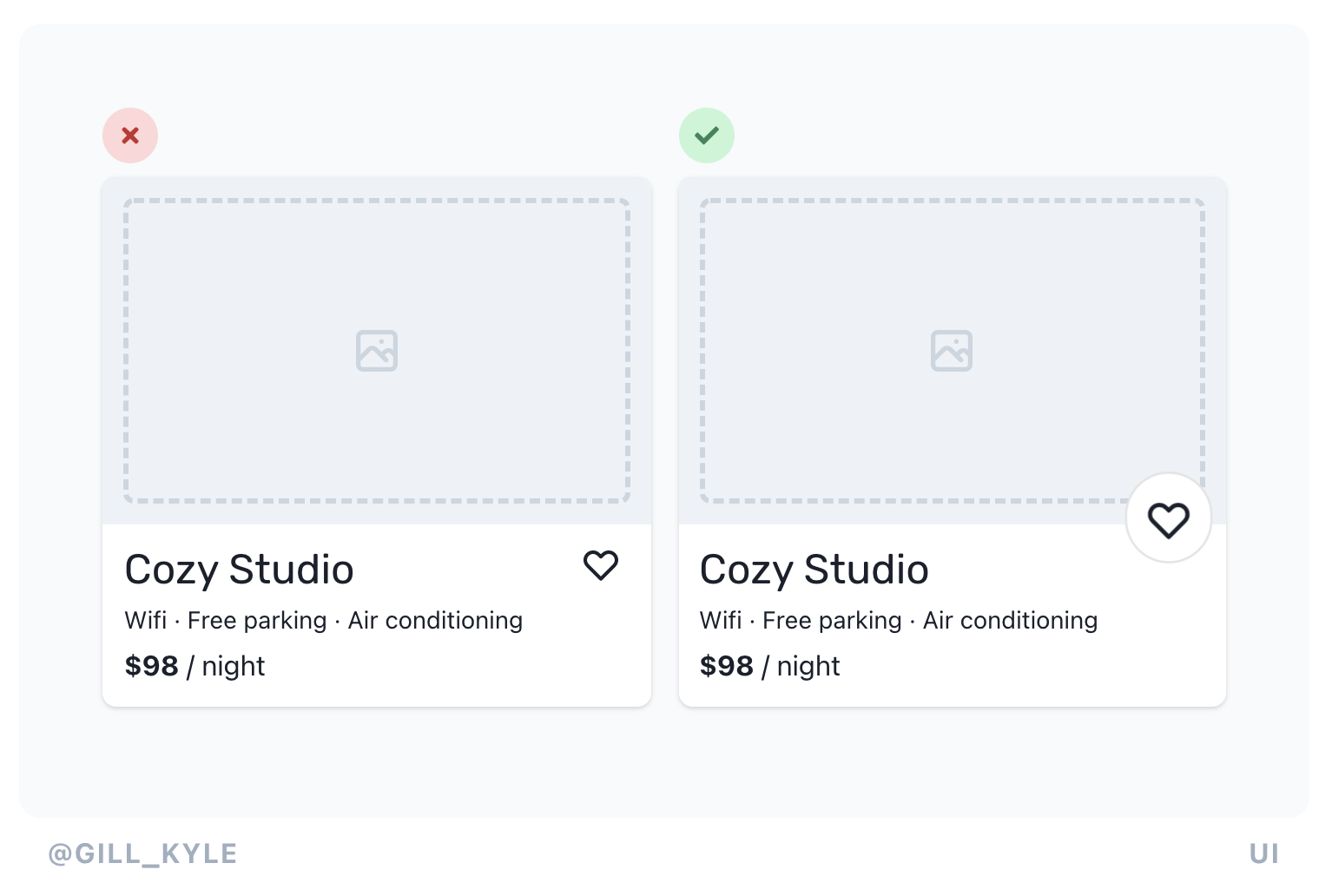
Material UI does this with their + buttons.
2. Add animations
Entrance animations, hover animations, and tap animations can all add to a button in subtle but important ways.
Consider scaling the button or text within it when you hover or click.
3. Add cursor: pointer
It makes a button obviously clickable to have a little finger pop up over a button! Consider adding it to something you know will be clicked.
You can't rely on this to signal a button is clickable though for users who navigate without a cursor.